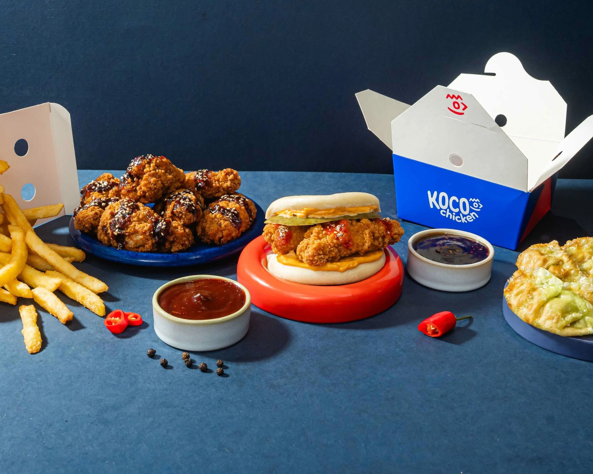
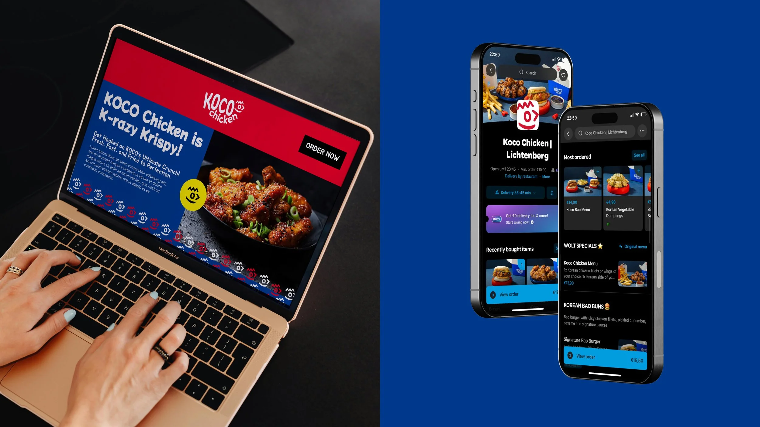
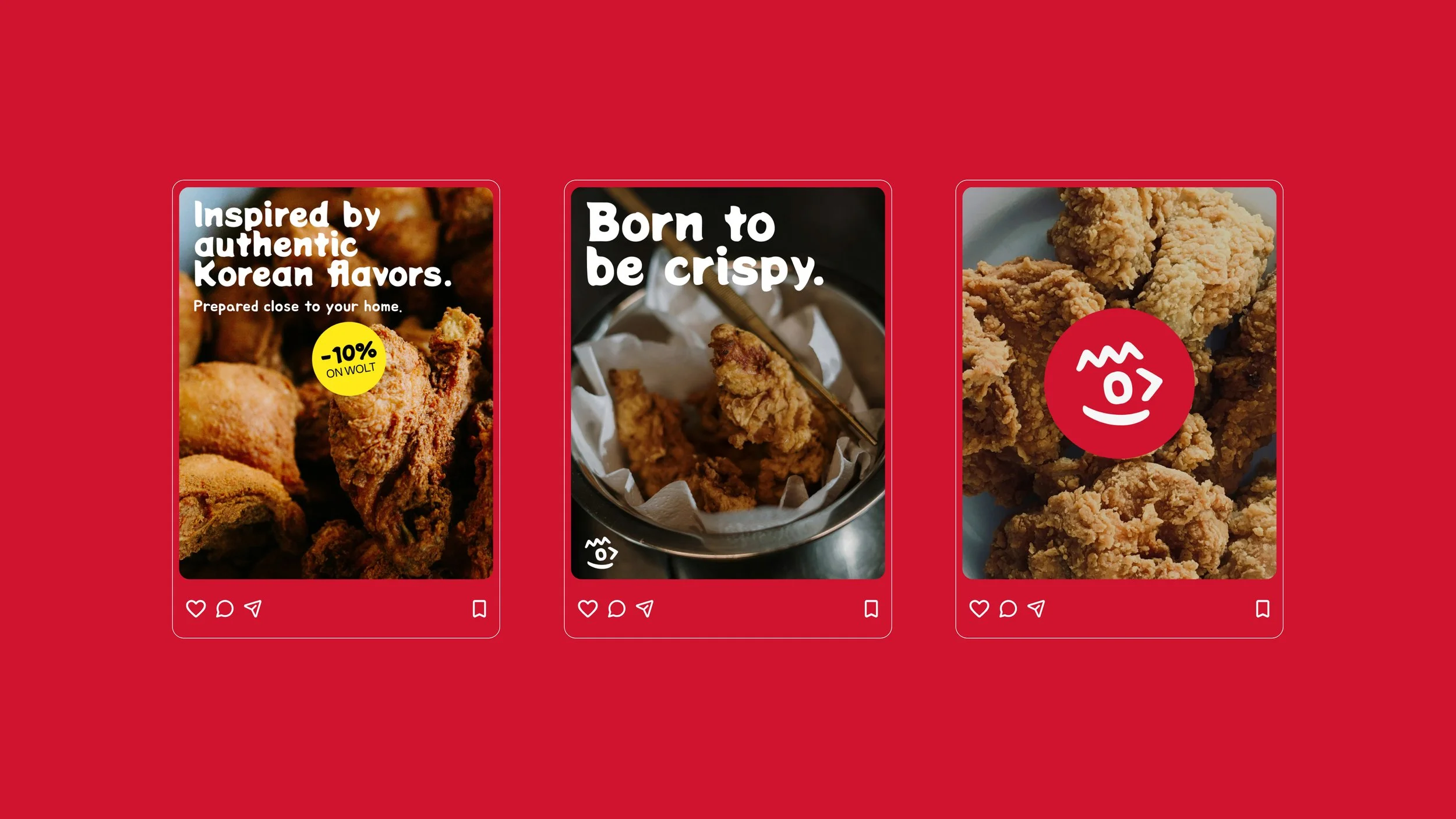
This branding was created under a super short deadline, pushing me to make bold, decisive choices. The chicken logo nods to Hangul, while the colors are rooted in the Korean flag with yellow as a lively highlight. The result is a fast, culturally grounded identity that feels crisp and modern.
Koco Chicken
BRAND IDENTITY


Team
With Moritz Fritzen